

The document examined here did not arrive as a curiosity. It arrived carrying the suggestion that it might inform strategic thinking at a high level. The document arrived with a deadline attached — a suggestion that a decision, perhaps a public posture, might be built upon it before the analysis could be completed. That suggestion is a ghost before it is anything else. It creates a pull toward usefulness: find the flaw, justify the trust placed in the request, produce the analysis that was wanted rather than the analysis the object earns on its own terms.
I record that pull here, before the first word of analysis proper. The search for a generous — or a convenient — reading began before the examination did. That is a convergence risk of the highest order. The fine is paid. The log is open.
The Object: The Borrowed Timeline
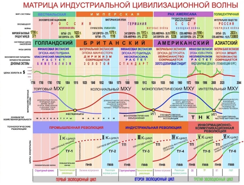
The diagram in question is not a crank’s doodle. It is a serious synthesis, and it deserves to be treated as one. It braids together Kondratiev’s long economic waves, Giovanni Arrighi’s systemic cycles of capital accumulation, Braudel and Wallerstein’s world-systems theory, and a more recent hypothesis — associated with the Russian economist Sergey Glazyev — of successive “world-economic orders,” each defined by its dominant resource, its dominant firm structure, its dominant technology. Four or five real academic traditions, stitched into one continuous timeline running from 1700 to 2044.
The stitching is where the trouble starts. Read the diagram left to right and something changes half-way across the page, without the page ever telling you it changed.
[Verified] The Dutch financial expansion. British industrial hegemony and the gold standard. The alternating financial and material phases Arrighi documented for Amsterdam, then Manchester, then Wall Street. The GDP shares through roughly 1990. These are drawn from outcomes that already happened and can be checked against the historical record.
[Inferential] The late-twentieth-century transition — the shift to fiduciary currency after 1971, the financialization of the last four decades. Recent enough, and contested enough, that reasonable analysts read the same data toward different conclusions.
[Unverified] Everything past the turn of this decade. The “Asian” cycle. The “polycentric” world-system. The “integral world-economic order.” A specific GDP figure for 2030, with a specific national protagonist restored to dominance. These are projections, plotted on the identical axis, in the identical font, as the continuous curve of verified history beside them.
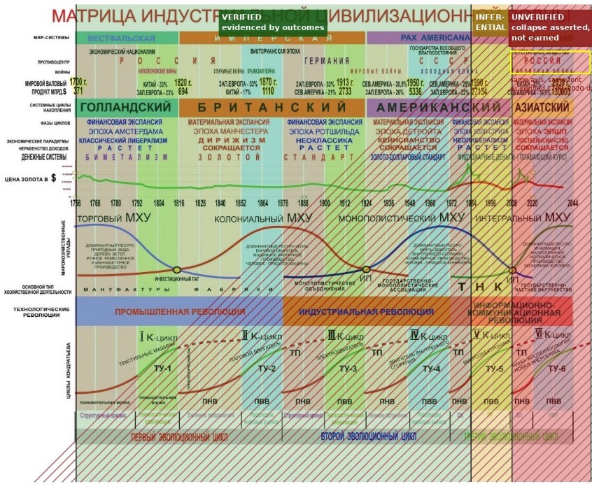
This is Scheduled Collapse — what Recognition Architecture calls a forecast dressed in the visual or rhetorical authority of a completed event. The 2030 column borrows the same font, the same axis, the same visual weight as 1820 and 1950, but it has not happened. The timeline treats it as if it has.
It is also Terminal Attribution. The “Asian” cycle and the “polycentric” world-system are named, bounded, and closed before the evidence for closing those categories has arrived. A category is settled in the artefact’s favour while the reality it describes is still open.
And between the 1990 GDP figure — an observed outcome — and the 2030 GDP figure — an asserted outcome — there is a Recognition Gap: the distance between what the narrative asserts and what has actually been demonstrated. The gap is the entire rightmost column, and the diagram’s visual grammar is designed to make the eye glide across it without noticing.
The chart, in other words, is inconspicuously performing four different operations and presenting them as one. It observes (Dutch hegemony existed). It interprets (Arrighi’s model explains why capital migrated from Amsterdam to London to New York). It projects (therefore a comparable migration is now underway toward Asia). And, without ever stating it outright, it prescribes (therefore a state should orient its strategy accordingly). Observation, interpretation, projection, prescription — four operations of increasing uncertainty, each one built on the one before it, and the diagram erases every seam between them. Every one of these operations licenses a different human action. Observation licenses memory. Interpretation licenses debate. Projection licenses preparation. Prescription licenses commitment. The danger is not that any one of these is illegitimate. The danger is allowing one permission to masquerade as another.
A forecast deserves to influence planning. It does not automatically deserve to settle argument. That erasure, not any single false fact, is the actual mechanism of the artefact.
The Uncanny Region: Why the Chart Feels Inevitable
The unease this diagram produces has nothing to do with obvious falsehood. It is unsettling precisely because its left half is genuine scholarship. To question the right half feels, to a reader already invested in the civilizational story it is telling, less like analytical caution and more like disloyalty to the narrative itself. That is not a flaw in the reader. It is the design working as intended. A forecast borrows the emotional and evidentiary weight of the history sitting next to it on the page, and the reader’s eye — which was never asked to notice the boundary — simply does not. The chart plays on intellectual FOMO. It subtly suggests: if you do not see the inevitability of this line, you simply lack the advanced systemic knowledge to comprehend it.
Triple Exposure
Human. The chart offers a grand narrative of civilizational rise, fall, and return — a story pattern older than any of the theorists cited on it. The ghost here is the oldest one in geopolitics: what if this time, the ascent is real?
Machine. The co-occurrence of “scheduled hegemonic transition”, a specific GDP figure, and a single named national protagonist, packed into one forecasting cell, has almost no precedent in the historical record this theory claims to be extending. Real hegemonic transitions were never dated in advance. They were named afterward, by historians, once the transition had already happened.
The Quiet Friend. Set beside the public record, the right-hand column has no support — it is asserted, not observed. Set beside its own internal logic, the column confesses something on its own terms: a forecast that were genuinely confident of its footing would not need to borrow the visual authority of a completed event. Confidence that requires disguise is not confidence.
The Fourth Exposure — The Channel. A diagram like this rarely travels alone. It arrives footnoted, cited, carried by people whose judgment the reader already respects, sometimes with the implicit suggestion that it might matter to a real decision somewhere. That channel is not incidental to the diagram’s effect — it is a second payload, riding alongside the first. Respect for the source functions as an epistemic operator: it raises, quietly and before any conscious weighing of evidence, the threshold at which a reader is willing to call the right-hand column aspiration rather than analysis.
Real empires do not schedule their decline like train departures.
Twin Sentinel Audit
Four questions, put to the diagram as if by a reader encountering it for the first time, with no theory to defend and no office to please.
- Why does the future look exactly like the past? Human: because that is how a good story is built — pattern completes pattern. Machine: because the chart’s visual system treats projection and observation as the same data type, and nothing in the rendering marks where one ends and the other begins.
- Why does the sponsoring civilization always rise in the last chapter? Human: because the last chapter is where the author lives. Machine: this is Terminal Attribution — the category is closed in theartefact’s favor before the evidence for closing it has arrived.
- Why does it need so many famous names? Human: because Kondratiev, Braudel, and Arrighi form a fence around the claim — hard to attack without seeming to attack scholarship itself. Machine: citation density correlates with perceived authority and does not reliably correlate with the empirical verifiability of the specific claim it is attached to.
- What happens if the line is wrong? Human: then whoever acted on it has to decide without the chart’s permission — which is where decisions were always supposed to be made.Machine: then whatever was built on the forecast — a strategy, a speech, a budget — was built on a column that never earned its place on the axis.
The Ugra Stand
In 1480, the armies of Ivan III and the forces of the Great Horde faced each other across the Ugra River for weeks. Neither side crossed. Neither side fired. Winter came, the standoff dissolved, and the Horde withdrew. Muscovy’s sovereignty was won there not by a battle but by a refusal — the refusal to perform either of the two scripts the moment demanded, collapse or charge. Standing in uncertainty, until the opposing claim exhausted itself, was the entire victory.
There is a second, less mentioned piece of that history worth setting beside it. For generations before the Ugra, Russian princes had ruled under yarliks — patents of authority issued by the Horde — and had then commissioned chronicles that used those same foreign grants to narrate their own destiny. The chronicle borrowed the Horde’s authority to tell a story about legitimacy the Horde had not actually settled.
A diagram that borrows Arrighi’s and Kondratiev’s authority to underwrite a specific national destiny is doing something structurally close to writing a modern yarlik-chronicle. The discipline this essay is arguing for is not a rejection of the underlying theorists any more than the Ugra stand was a rejection of the Horde’s existence. It is the discipline of noticing whose hand is actually holding the pen at the point where interpretation quietly becomes prescription — and of standing on the riverbank, rather than crossing in either direction, until that is clear.
The Limit of the Architecture
If an artefact like this is built — deliberately or simply through the accumulated momentum of a school of thought — to move a reader toward committing a long-term posture to an unearned teleology, then refusing to collapse into either acceptance or dismissal is the disciplined response. But only if that refusal is public and named, attached to the document itself rather than held as a private reservation. A silent doubt changes nothing. A named boundary — verified ends here, asserted begins here — changes what the document is allowed to do next.
It is worth being precise about what is and is not being argued. This essay does not claim that a more multipolar, Asia-weighted world economy is an unreasonable expectation, or that the underlying political project — whatever integration or reorientation it serves — is mistaken. It claims only that this diagram’s evidentiary foundation does not support treating that outcome as settled. That distinction is what keeps this analysis from being opposition research dressed as method. It is what makes it Recognition Architecture rather than argument.
The exercise, in fact, has never really been about this one diagram. The same visual grammar — continuous axis, shared font, unbroken curve — appears in RAND briefing graphics, WEF scenario maps, national development roadmaps of every government that commissions them, IPCC emissions pathways, consulting-firm forecasts, campaign maps. Every one of these uses color, layout, and continuity to convert uncertainty into the appearance of inevitability. What is being audited here is not a chart. It is diagrammatic authority itself — the tacit convention by which a forecast is allowed to borrow the evidential weight of a history it has not yet lived.
CODA: The Question Left Open
Can a state, an institution, or a person act with confidence without treating prophecy as a planning assumption?
The Ugra stand was not paralysis. It was sovereignty — the capacity to hold a threat in view without either fleeing it or performing its script.
A forecast should not inherit the evidential authority of history merely because both are drawn with the same pen. Readers who disagree completely about whether the right-hand column will turn out to be true can still agree on that one sentence — and that agreement is worth more, in the long run, than winning the argument about the 2030s.
An Orthodox icon is never mistaken for the saint. It points to one. It never becomes one. The faithful know the difference. Modern diagrams often forget this distinction: they begin by pointing, and end by pretending to be reality.
Russian navigators in Siberia once travelled the zimniks — winter roads that existed only while the ground stayed frozen. Maps showed them. Travellers depended on them. Everyone understood they were temporary. A zimnik is entirely real without being permanent. The error begins when a road built for one season is mistaken for the shape of the land itself.